

Made this design for Proto.in, the second edition of which is coming up in IIT Madras on July 21-22 2007. And yeah, did all of this sitting in office since I really didn't have any work to do ( I still don't have). You can get gyaan about Proto.in here on their site.
Also made this badge: 


Conceptualized and Designed by Vatsap
This is the raw version of the External Publicity (EP) Tee for Shaastra 2007. If you wanna grab this tee, be there to help the IIT Madras team that arrives at your college for putting presentations on Shaastra. They have other free goodies to offer too. So all the best.
 My class. Parting time is up. Only few of us will be staying back for two more sems to complete our masters in Infrastructural Civil Engineering. It's a strange feeling. It's strange to realize that four years have passed!
 This cartoon is cute! Isn't it? I think four posters in this series are enough. And I hope guys and girls following my blog will try not to waste food, the next time they take food. And to put it forward in one of those 'filmy ishtyle', I would feel my job is done if my posters are able to change the wasting habit of even one student! :P
 Did I ever tell you I love Stewie? Ok, I do love him. He rocks!

 Someone suggested me to also come up with some funny posters so that the mess environment becomes a little lively. Well, here's 'fun' for you. I hope the message is still clear. And once again, like the 'Show Respect' campaign, I think I can easily come up with lotsa similar posters.
 Insanity thrives
Feel the vibes
Blood trickles
Feel the pulse
Flesh decays
Feel the daze
Cells burst
Feel the thirst
Pain kills
Feel the pills
Air poisoned
Feel the end

 I guess two or three more variations will do. Does anyone of you think that I should include 'Don't waste' kinda stuff in here? Let me know. As of now, it looks pretty much neat to me.

This is the first poster that I made. Later I realized that it was kinda scary to be put in a place like mess. Nevertheless, feedbacks to improve this evolving piece of art are welcome. One option of course is to put a less scary pic!
Any one got any ideas? I also have a slightly different approach in mind. I have been working on it. Hope to come up with it soon.

Are you wondering why am I suddenly asking you guys to fight AIDS? I can explain.
A couple of weeks ago, there was an IP (read notice) put up in my hostel. It invited submissions of logo/web-template designs for an NGO called "Fight Aids in India". I tried making a logo because there was a cash prize attached to it! The prize for the logo-design was 500 bucks while that for the web-template-design was 1500. In case you are wondering why I chose to make only the logo and not the web-template, I should tell you that making a logo takes something like 15 minutes while creating a template definitely takes a lot more time (at least to me). Basically 1500 bucks was too less a prize money to motivate me to try making a template (which might or might not have been selected). Fifteen minutes was worth betting for.
So my 15-minutes of graphic stint ended with this logo that you see below. The good thing is that, today I was informed that this logo has been selected. :) Good news. Isnt' it? The better thing is that I am richer by 500 bucks! And can I also add that I in my own way also contributed towards fighting AIDS in India? ;)

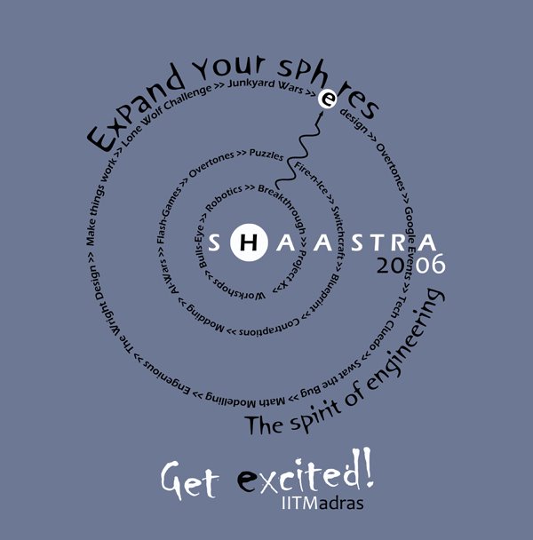
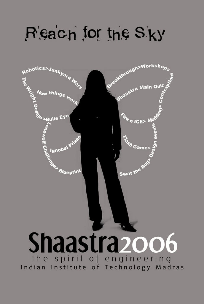

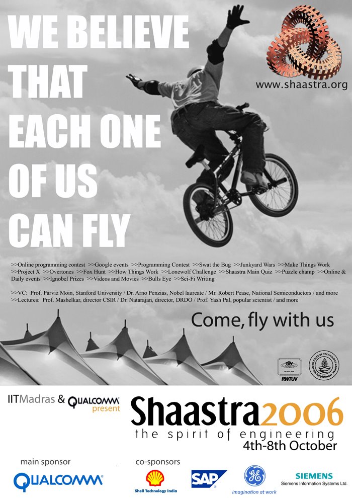 Shaastra 2006 is bigger than ever. And it is going to knock you down with it's super high energy content. Afterall it's about the 'spirit' of engineering! Time to get excited, is it?
I finished creating these two print ads for Shaastra2006 very recently. They should soon reach most engineering colleges within two weeks or so.
Shaastra Design: An Insider's Take
12 comments Published by amrit on Friday, June 09, 2006 at 11:19 PMYou will find this journey interesting. I plan to take you to a small ride over the evolution of a digital design.
I am heading the design and ambience department at Shaastra 2006 (Shaastra is the technical festival of IIT Madras, and its a huge huge thing in India!). The ambience department has to do with sort of technical stuffs, but the design guys are supposed to come up with new digital designs for posters, pamphlets, t-shirts, banners etc.
Will come straight to the ride, that I was talking about. I was asked to come up with a design for an EP T-shirt (EP stands for 'external publicity', and we have a lot of EP guys, of course all of them students, who go to various colleges in India in the three months long summer vaccation, and distribute these T-shirts for free). So the better the Tee looks, better is our publicity. If you are wondering, from where do we get all the money in this world to distribute free Tee's, I should tell you that we have a separate sponsorship department too and their sole job is that of getting sponsors for each and every acitvity that goes around, for Shaastra. When I said, its huge, I meant it!
Ah, why does this have to happen each time? I start with my design story and for some reason or the other I get into how organized an event Shaastra is. But it sure is organized and this is the reason, we are the only guys till now to have an ISO certification for a technical festival. Yeah, so let me talk about the Tee now. I have some Design coordinators (five of them to be precise) who are supposed to work for me. But only two of them were in town when this work came my way (the rest had gone to home; vaccation time!). I asked these two guys of to work on it.
You can click on the images to have an enlarged view.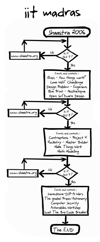 This flow chart design was a creative thing, sent by one extremely creative coord. But it had too much of text, was too long and I didn't find it visually too appealing. Something better than this could definitely be worked out. This guy who did this flowchart, sent one more design too. Yet again, I found it visually unappealing.
 The other coord (yeah we don't call them _coordinators_ for God's sake) came up with the following three: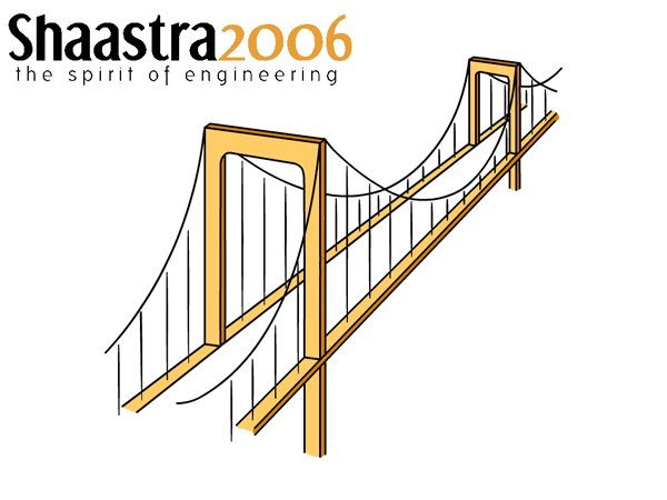
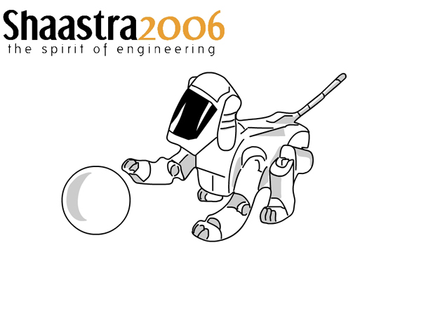
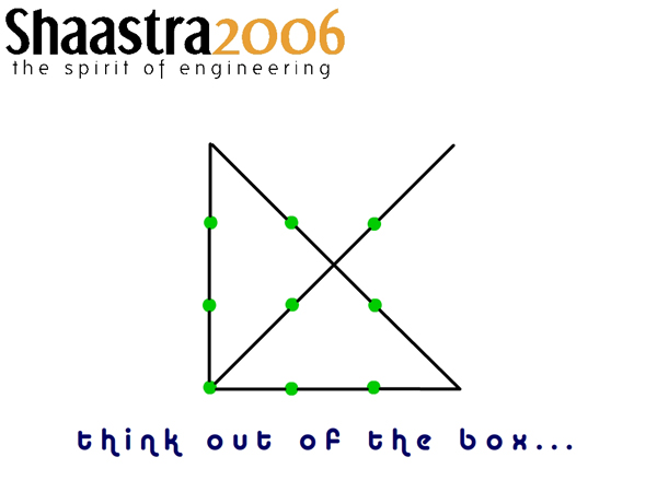 Out of these three, only the 'out of box' had some funda to it. You don't get that? Well, the image is of a solved puzzle. What puzzle? The question is to join all points using just four straight lines in a single stroke. You get that now?
The other two were neat and good looking but ordianary! But then even though the out_of_the_box (OB) one had a funda, it was still kind of too plane and simple. So I asked this guy who had sent these three designs, to try to modify the OB one and make it look more appealing.
Many days passed, but no furthur progress on the Tee design looked like happening. I had time with me, but only till a sponsor for the Tee was finalized. We cannot fianlize an EP Tshirt design till we put the sponsors logos and till the sponsors apporove it! But I knew that the guy heading the spons department, was sooner than later, going to declare that he had found a sponsor. And that finally did happen!
The design was not yet ready. In the mean time I had also mailed the out of the box design to another coord who was in home. She had agreed to work on it from home itself, but she never mailed anything for two weeks.
One day, I finally thought to finish it myself. So I took this OB design, and made this stuff and mailed it the core mail group. Yeah, we the head of various department in Shaastra call ourselves cores and we do have a mail group where we discuss each and everthing that needs to be. And to be technically correct, I am the Desing-Core for Shaastra'06. Here is the design. But the general response was that, something better could definitly be done. And many of them pointed at the extra big size of the sponsors logo! I knew that of course! But my intern had already started, and I didn't have the time to work on it myself. I wanted ideas at least to begin with! So I made call to the group asking all of them for ideas. In the mean time, the coord from home did mail the following stuff but it was still not good enough.
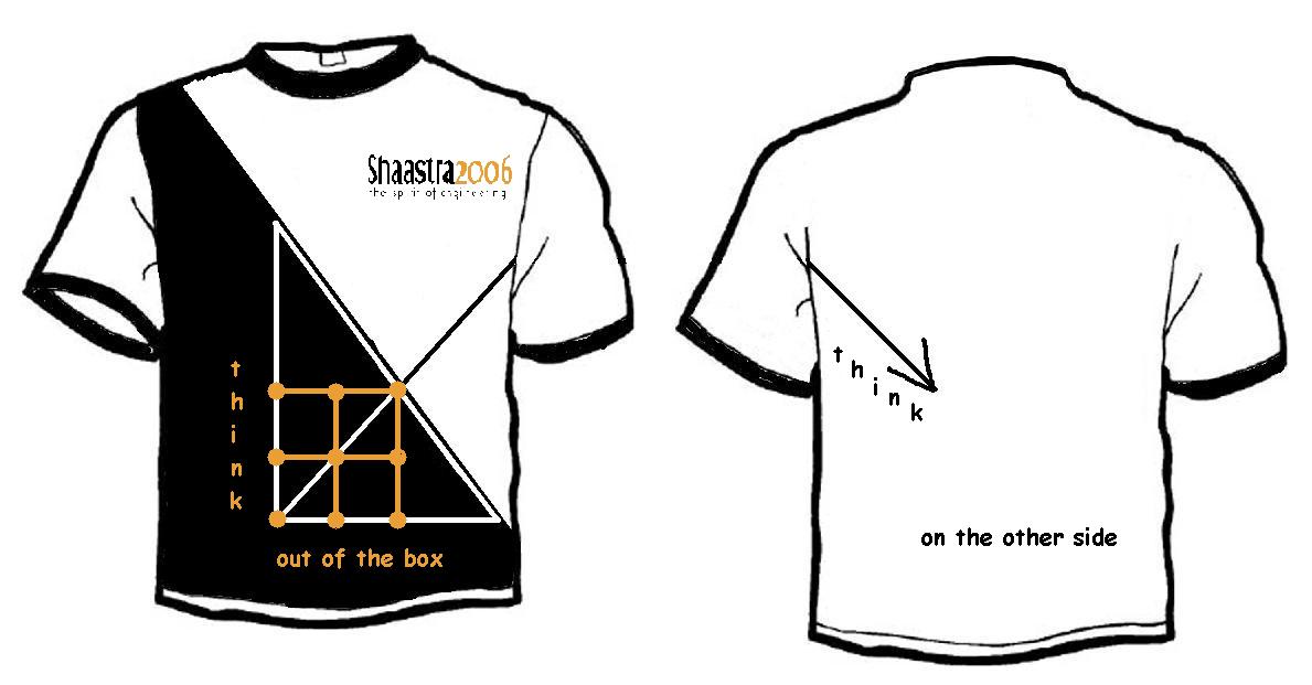 Till now, all of us were basically revolving around this idea of out of the box and as a result no out of the box idea actually came.
The mailing group came with lot of ideas, and two of them need a mention here.
The first one was to use the mobius stip funda. But no one, including me could figure out how exactly to use that!
The other one was really brilliant and I am sure, some day or another, someone is definitely going to use it. It came from non other than the spons-core himself, who suggested I use the alogrithm to generate a buddhabrot on the front side of the tee and the image of the buddhabrot itself on the backside. And he also suggested some nice slogans. One of them went like this: 'Be religious' on the front and 'in your own way' on the back! Yeah this one was surely a rocking thing. The best thing till now. This is the Buddhabrot image: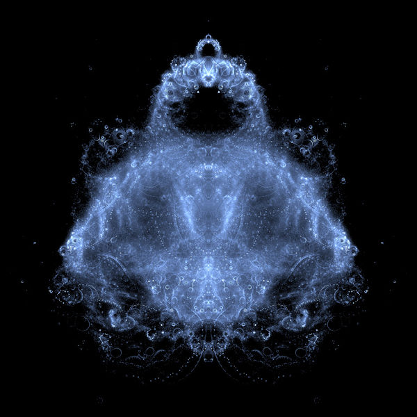 But then like everything else it had a problem too! This image that we needed to print was not a simple one. On posters it would have come great, but no, not that great on a Tee till one made it real costly by going for high resolution prints! You must have noticed that all the other designs used minimum and flat colors. I had especially instructed my coords to do so.
So here, this great idea was wasted!
I had asked the guy who had made the flowchart to work on some other idea as well. And it was pure coincidence, that he too came up with nothing else but a buddha idea! He mailed me this image that he had created, the same day that we were discussing the buddhabrot thing.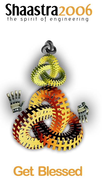 This guy sure was creative. He had used the Shaastra logo to build this Buddha looking thing. Cool! But somehow I felt that it again wont look good when printed on a Tee. And somehow, this thing looked more like Ganesha than Buddha! And wait a second, I said to myself, what's wrong with Ganesha afterall? And I thought more. Why is it necessary to use the Shaastra logo for making something which looks like a God? Why can't I use some stuffs which are kind of technical like gears and all but yet, when put together, look like Ganesha. Yeah, why not?
Thoughts had started flowing; I had got an idea to begin with. I Googled and tried to figure out the most basic symbols that make Ganesha look like 'Ganesha'. I already knew that the ears, the trunk, and the tummy would do the job, but I Googled anyways. And this image caught my attention.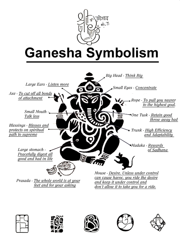 It would be great if I could work out something like that. I started working on it and finally came up with this thing within two hours (it was later made into a better resolution by one of my coords). I call it "Technesha"!
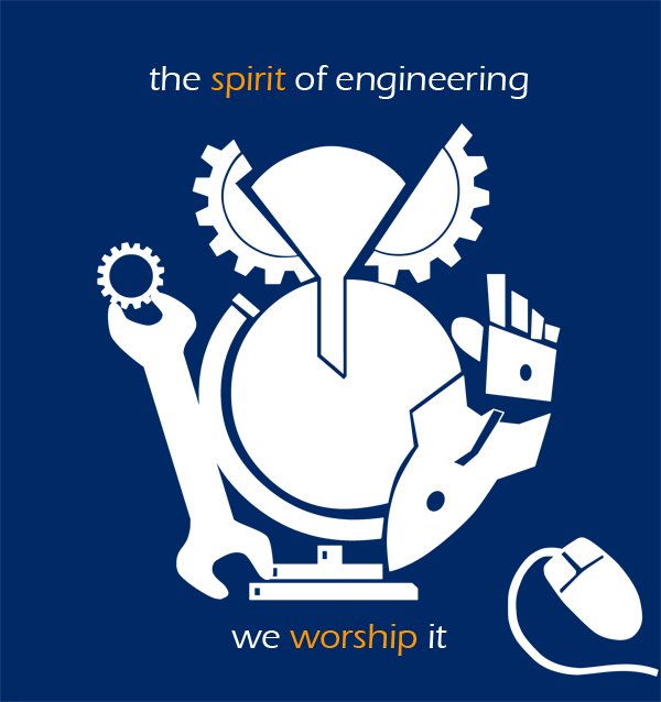 Hope you like it. The solution to the Tee design was finally realized. I will post the completed design once the sponsors have approved it. Don't want to spoil the fun by posting something which can be changed later. And hope that you had a nice time journeying with me through the evolution of this Tee! So the next time, you see some guy wearing this in your college, I hope you will realize the effort that was put in coming up with the final output. And hey, of course things can always be made better, but then you never have all the time in this world for anything. :)
||Om Shaastraay Namaha||